Thank You!!
| July 10, 2012 | Filled under My Book, Writing a book |
Thank you so much dear ladies for your comments about the diagrams!!
Personally I like first version much better too and I’m so glad we are on the same page, yay!! :o) The only thing I’ll probably change is orange to turquoise or lime green—let me see.
I would like to comment about some of the interesting points for the colors on the diagrams, as Krista and Mary mentioned:
[quote author="- Krista"]I like both for different reasons. I like the way you have your pattern “breaks” laid out in version 1 better. And I like the color scheme of version 2 better. The dark and light break it up perfect and don’t make it too busy(or maybe it’s just because there’s only 2 colors. Is the row red because it’s the repeat row? If so, then I think the red circle and dash lines do the trick just fine without the whole row being red.
Just my opinion. Hope it helps you to see how others look at it.[/quote]
[quote author="- Mary from Australia"]The first version definitely seems to me to have clearer definition! I always do prefer the charts, and, I think using a new colour for every line is the easiest to read quickly. If I am reading from a chart which is only printed in one colour, I actually use my coloured pens & retrace over each line using a new colour. Whilst this is a bit time consuming in the beginning, I still find it faster in the long run because I can quickly follow the current line I am up to without constantly stopping to check if I am following the correct line of symbols.[/quote]
Kristal Motif (used for Petalline Halter Dress) is a good example of my final color preferences. It’s 21 rounds motif and I’ve tried different colors for every other round, but which would look “readable” in b&w print too. And then during testing (for 4 more garments using this motif), I found that my eyes prefer black and grey version much more. And if talking about style, I really like grey/black version better too. As Krista said, black and grey diagrams are not too busy and pretty readable. The contrasting turquoise, lime or tide of orange I use to highlight repeats, joining motifs, etc… It’s work so far, but I still play with my own style, so let me see ;o)
Also, many thanks to Amanda for comment about breaks:
[quote author="- Amanda"]I like version 1 better for the different colors, especially for row 3 and the repeated rows. I like version 2 better with the way you did the breaks. It seems more natural to me to have a continuation of the pattern around denoted with a dashed line rather then a break and a jump in pattern rows shown by a break rather then a dash. I love that you include the written instructions along with the chart. I like to read through the instructions before starting to make sure that I am reading the chart correctly.[/quote]
In diagrams with one repeat/continuation (example: blanket border) I really like to use that “weaves” break (like laid out in version 1) than dashed line. But break in version 2 looks not clear enough for me, even if probably seems more logical than in version 1. We will see how it will work with other diagrams, and find the best solution for sure.
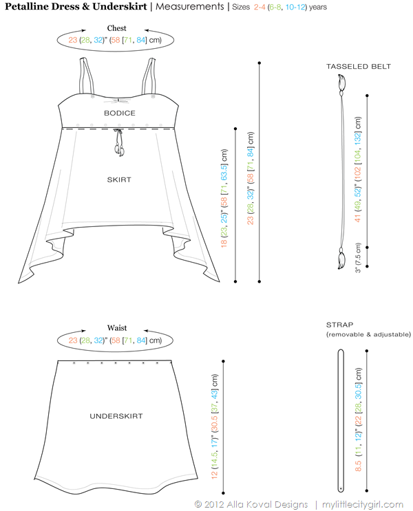
And below is sneak peek of my ~one more realized dream—I can draw LOL!! Well, even if it’s just simple schematics in Illustrator, but who knows ;o)
A wonderful and lovely Tuesday everyone!! We have 4th day of summer here (finally!!!!), so definitely enjoined it! :o)
Alla Koval Designs


 Shopping Cart


Have a nice say Alla!
Have a nice week Alla X) waiting for the lovely skirt pattern. just adore it :)
oh and amazing drawing !!!